Analytics
Analytics reads the same matched trades as the calendar, across whatever range and accounts you have selected, so anything that changes the Journal changes this page too. If a number looks wrong, check Journal Settings before anything else.
The four coaching gauges (Edge Score, Win Quality, Consistency, and Risk Control) are on Insights.
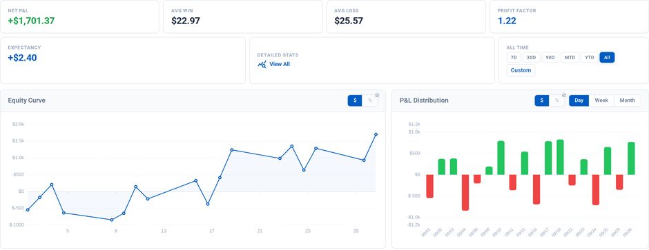
The headline row, the equity curve and daily P&L
Statistics
A row of headline numbers opens the page: Net P&L, Avg Win, Avg Loss, Profit Factor, and Expectancy, each clickable for an explanation. Detailed Stats opens a drawer with the full breakdown:
Trade Stats: trades, W/L, win rate, profit factor, average winner, average loser, W/L ratio, expectancy.
Risk: max drawdown, recovery factor, Sharpe, Sortino, R-squared, win streak, loss streak, trading days.
Execution: best and worst trade, best and worst day, hold time, trades per day, entry, exit and total efficiency, and commissions.
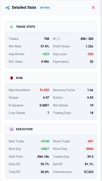
Detailed Stats: the full breakdown behind the headline row
Charts
Equity curve. Your cumulative result over the selected range, with a dollar/percent toggle. Percent needs a known account balance baseline; without one it falls back to dollars.
Daily P&L bars. Per-day result across the range, with the same dollar/percent toggle.
MAE vs MFE. A scatter of every trade's maximum adverse excursion against its maximum favorable excursion: how far each trade went against you before it worked, and how much was on the table at the best point. It shows whether you are stopping out too tight or giving back too much. The same card flips to Metrics Over Time, which tracks win rate, average win, and average loss across days so you can see whether a change in approach actually moved them.
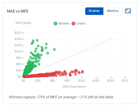
MAE against MFE, one dot per trade
Time of Day / Day of Week. One card, two views. Both answer the same question from different angles: when are you actually making money?
Symbol Performance. Result per instrument, which is where a strategy that works on one product and not another shows up.
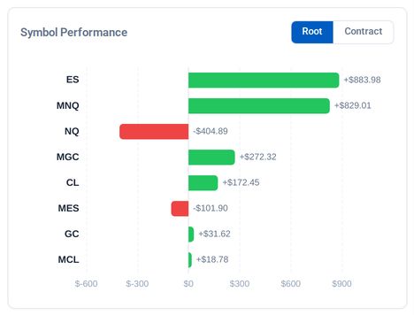
Net result per instrument
Going further
Tag your trades in the Journal and the breakdowns get more useful, because you can see which strategy or setup is responsible for the numbers instead of only the total.
For "will I pass this evaluation", see Insights.